
Design
Botanica: What's Changing
Botanica has been in conception for months. Religiously re-analysing each surface, each dimension or curve, I felt like I knew this board like a beater that you've rebuilt a thousand times.
Then the prototype came, and the object itself had its own opinions.
This is what the prototype is teaching me, and what the next prototype is built on.
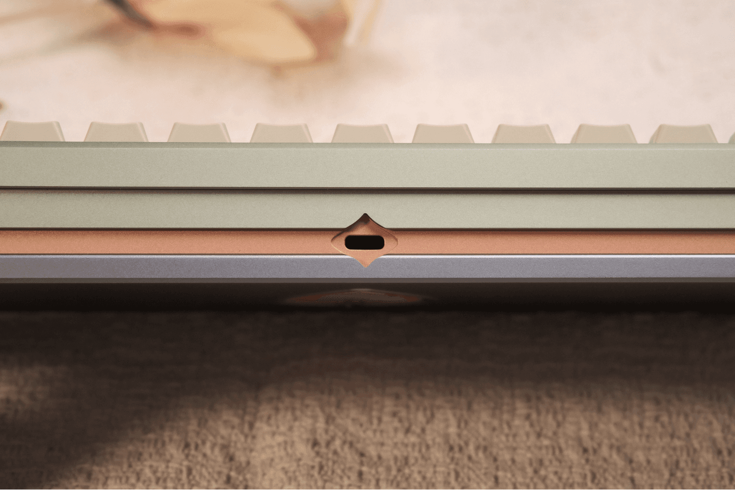
Photo by Lamy
On Sound
The objective for Botanica’s acoustic profile was specific: warm, characterful, and cohesive across the alphas and the spacebar. I wanted presence, not a one-dimensional note.
The board that I received didn't get there.
The board was tinny.
Not pingy in the way a poorly built board is pingy, but overly restrained.
The problem was the copper mid-piece. The most visually striking element on the board, and acoustically the most dominant.
The volume of dense metal in the lower case was stifling the gasket rather than working with it. The sound had nowhere to go.
What should have added character was removing it.
For the second prototype, the materials has been reworked.
Changing the bottom to beadblasted stainless steel, giving the mid-piece additional freedom in expression for CMF.
The ratio between the dense and the lighter metals were rebalanced, and the surface areas have been carefully considered to ensure that the Poron Gasket mounting may express itself as intended instead of fighting against the mass that encloses it.
The objective has not changed, but the path to achieving it has.
On the Bottom Design
The bottom case features a leaf emblem centered on the surface.
In theory, it reads as considered: A stylised callback to the botanical concept, and split into four sections that mirror the side profile's language.
In metal, it was shallow.
The execution lacked contrast and depth.
While the updated design in the IC attempted to address this, the community feedback was clear: the bottom still felt "underbaked."
I had to reconcile with the fact that, despite my changes, it remained unconsidered.
With no expense spared, the bottom has been adjusted once more to match the care and attention the rest of the board has.
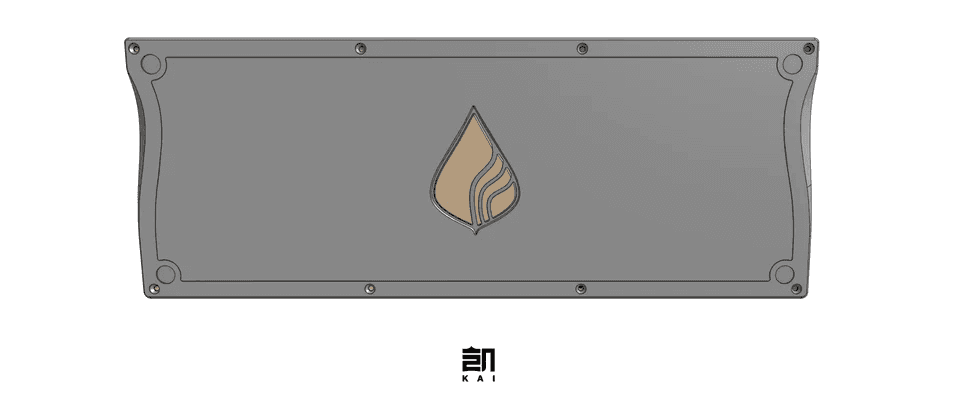
The IC's iteration of bottom design
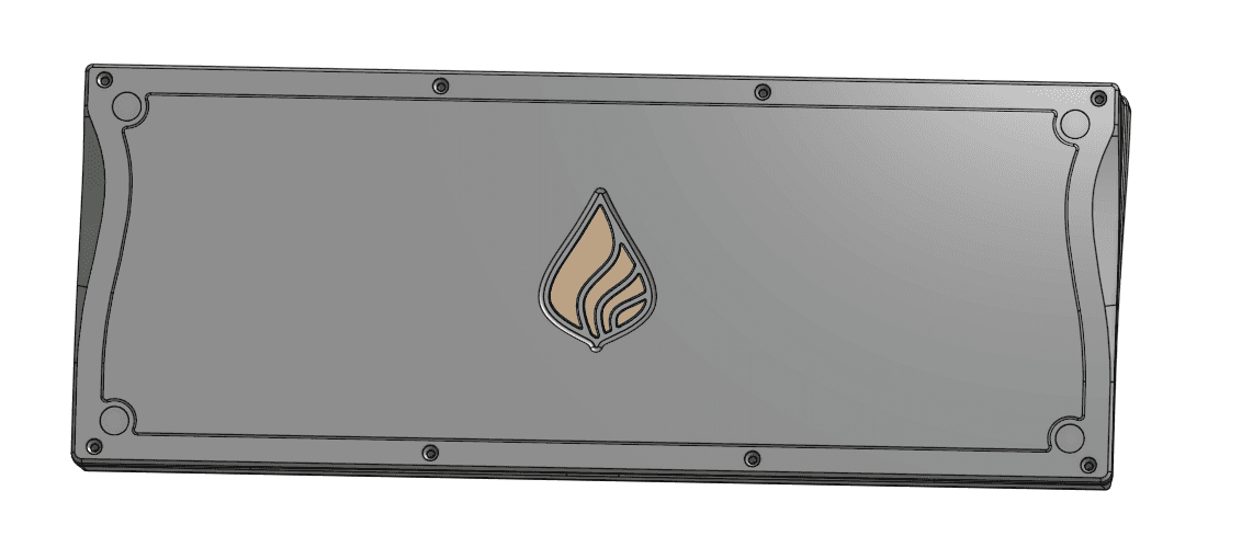
The updated bottom design
The leaf emblem has readjusted and reduced in size.
The emblem was way too big.
It was dominating the bottom surface in a way that competed with the form rather than complement it.
A detail that size stops being a detail and starts being a statement that is saying something completely different from the rest of the board.
Two refinements also come with the adjustment:
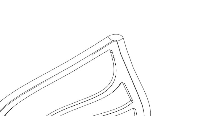
Emblem Edge Breaks
The edge breaks on the emblem have been changed: a sharp chamfer now accentuates all of the leaf rather than the outline.
Additionally, a subtle inner fillet has been added to compliment the sharp leaf, giving the leaf additional dimensionality without overstating.
Now, the change I'm most satisfied with:
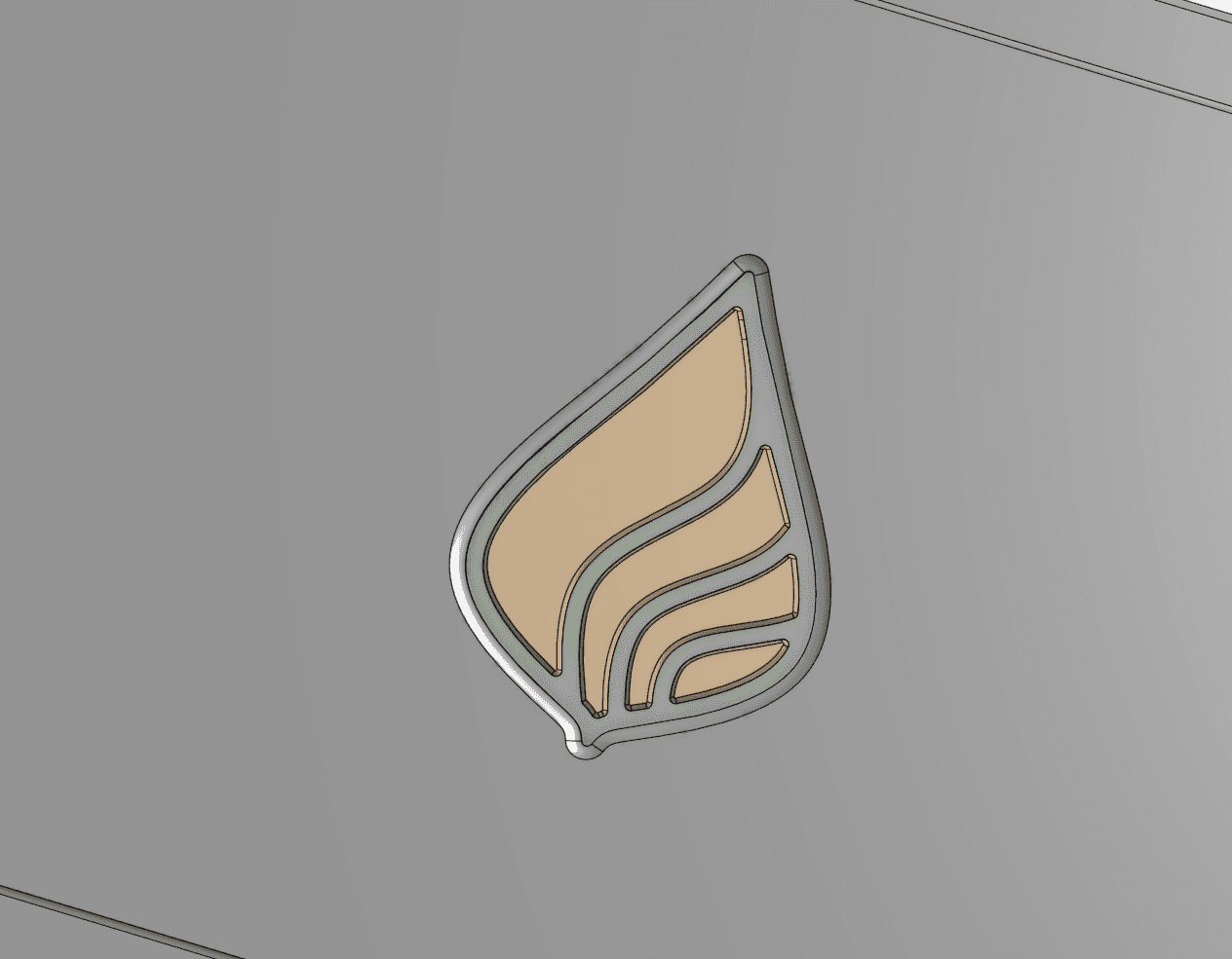
Introducing Emblem Accent
The emblem now sits against a background accent in the same colour as the top case.
A third colour introduced to the bottom surface, mirroring the way the third colour of the accent reveals itself on the rest of the board only when you look for it. The bottom is now in conversation with the whole where it wasn't before.
On what's next
Botanica is capped at 50 units because it is the number at which I am confident in personally ensuring that every detail of production and fulfilment is held to a higher standard without compromising on either.
Botanica will not be sold as a proof of concept, but a cohesive experience that has been corrected by reality.
The first prototype exists so that the second can be better, and the second will exist so that the production run can be made even better.
This is what the process is for.